concept development, identity, signage & wayfinding, merchandise


Strategy
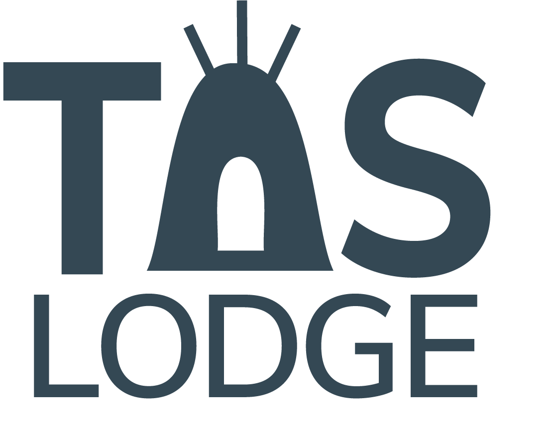
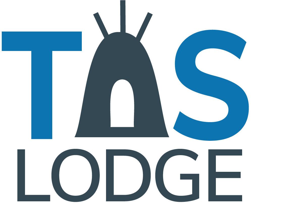
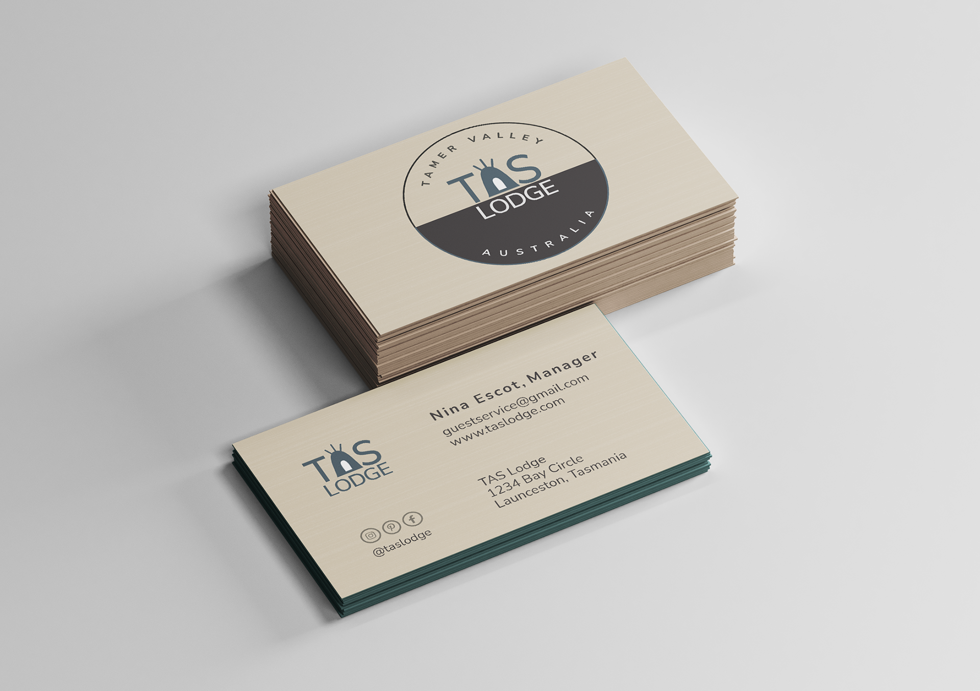
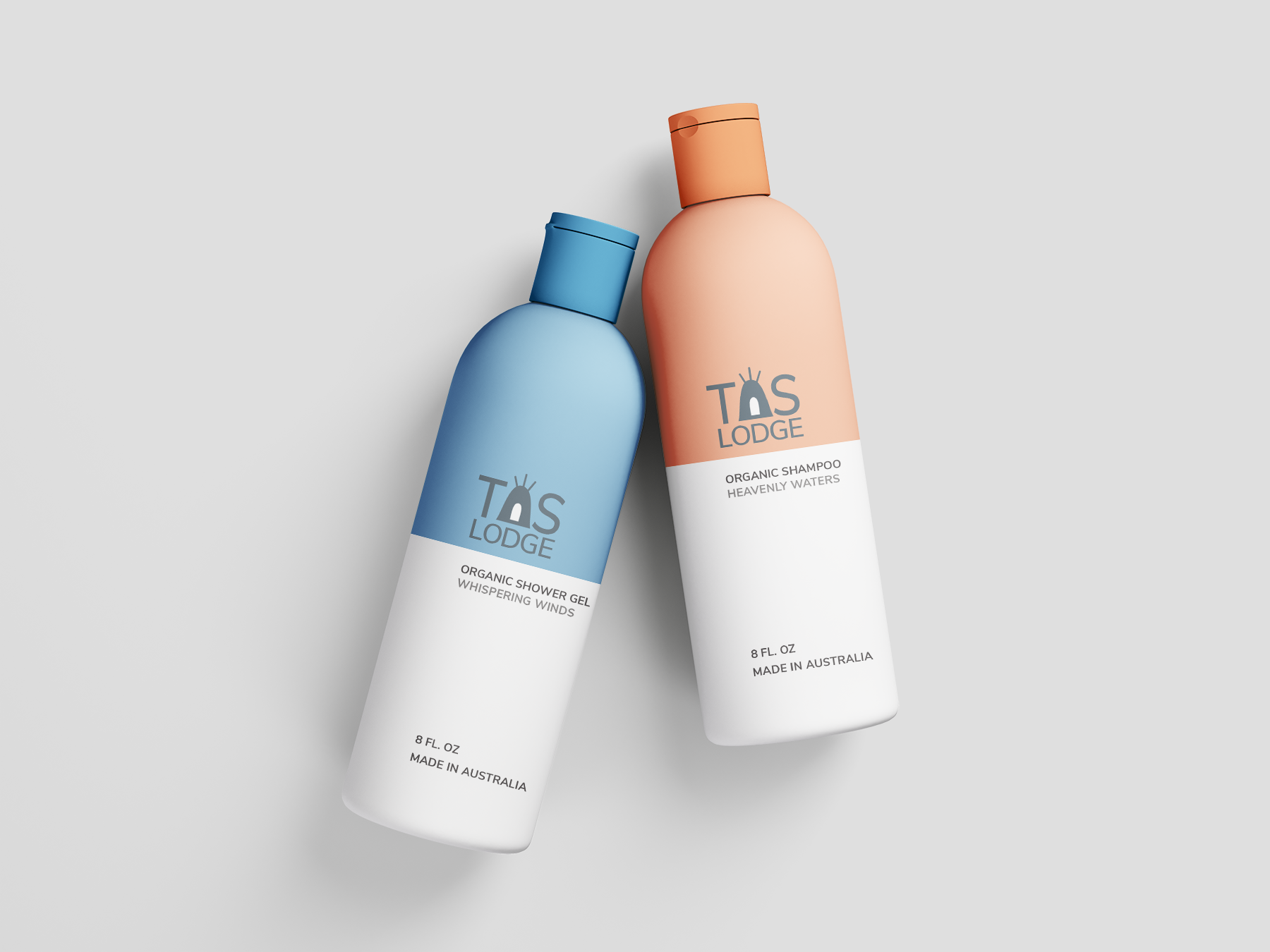
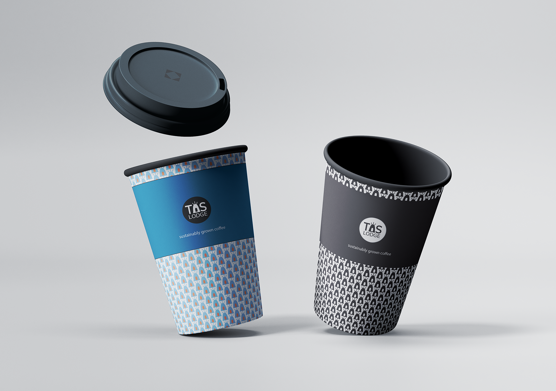
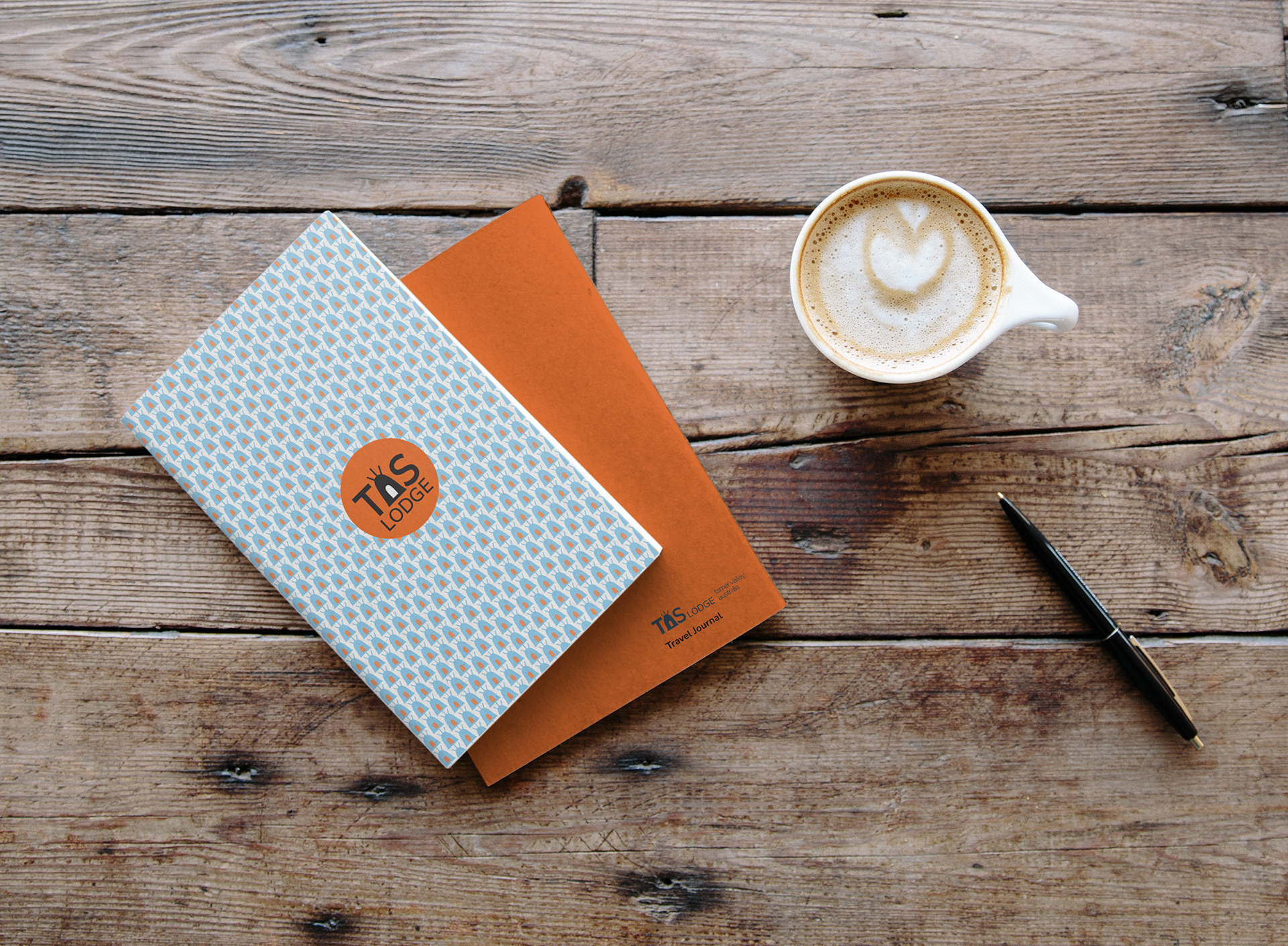
Nunito Sans was selected to compliment the “yurt A”. The angles along with the wide open “O” lend to an inviting look to the property.
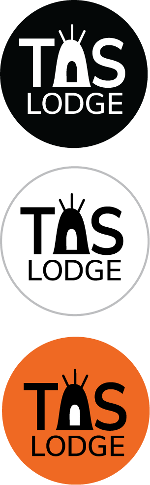
Responsive logo design was done to support social media needs as well as large signage.
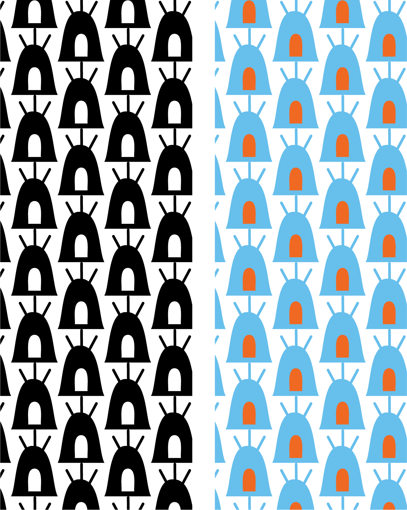
Colors reflect the blue waters of Tasmania and the bright orange on the rocks. It is like living in technicolor.
Tools used: Adobe Illustrator
Target Audience
Guests looking for the comforts of a boutique hotel offering outdoor setting.