redesign, book cover design, typography
Strategy
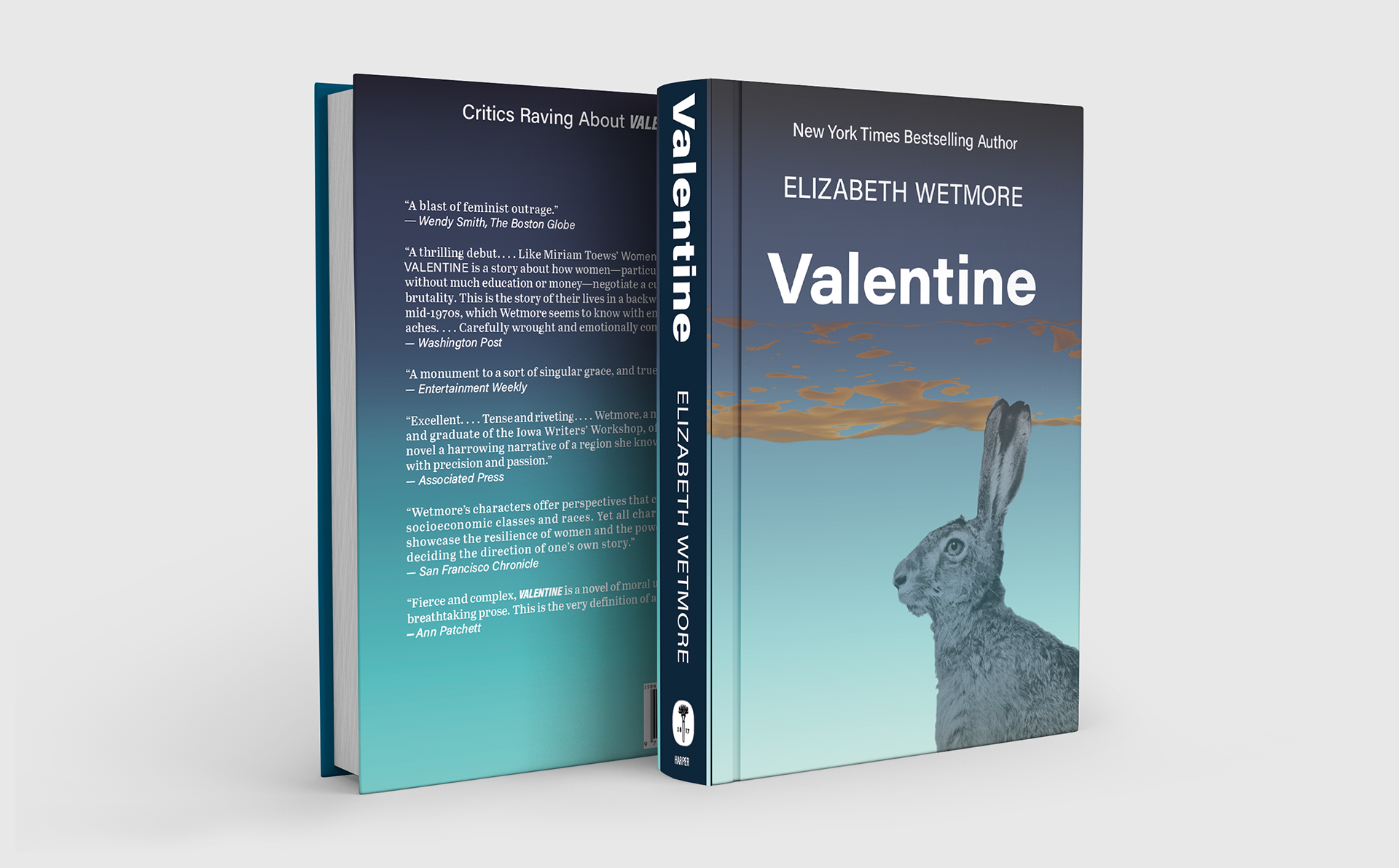
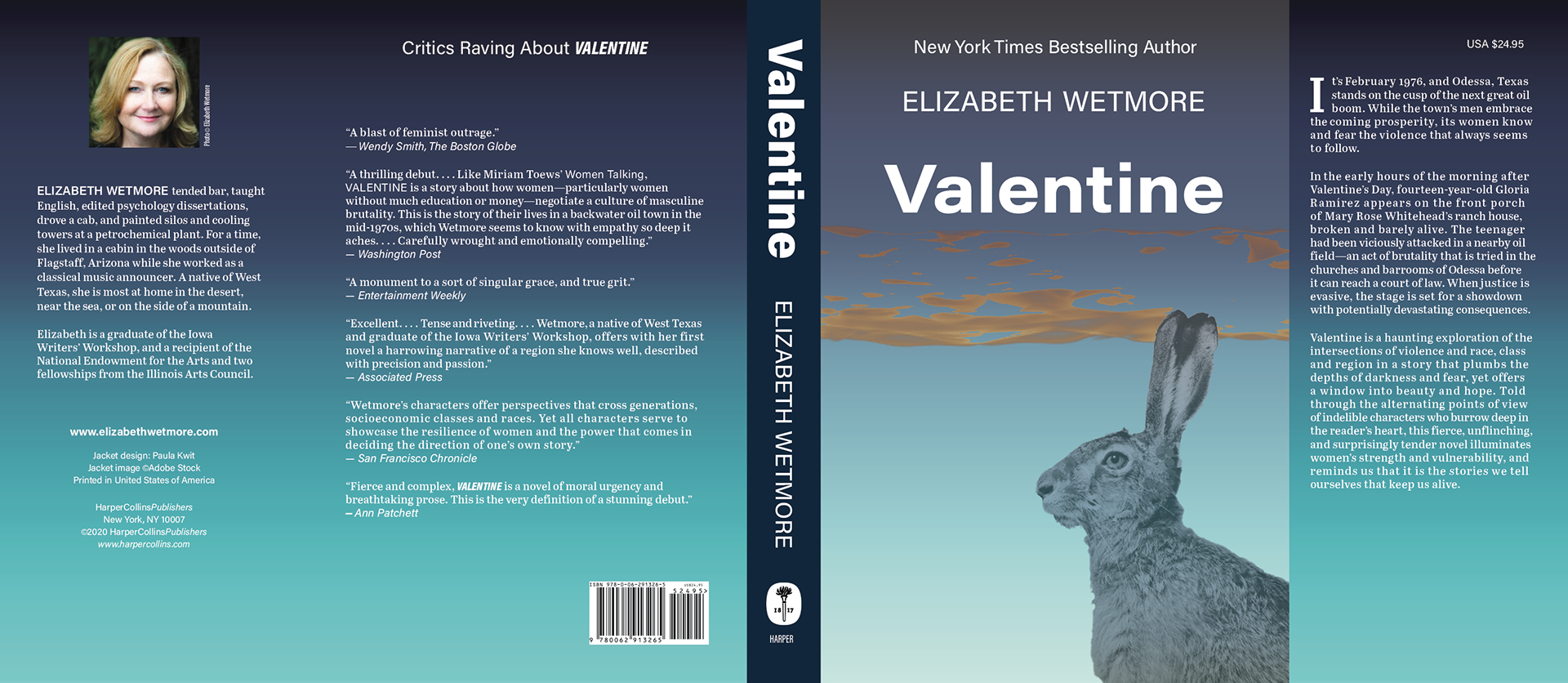
The contrast of the title and the theme needed dramatic colors of tension blue green, late sunset orange, and edgy amber used in the low distant clouds (or is that flare off?).
Acumin Pro was used as the main typeface on the cover for its strengh symbolizing the women in the book. Abril was used as the text typeface to provide a soft contrast. Tools used: Adobe InDesign, Adobe Photoshop
Target Audience
Readers of bookclubs interested in the genre of based on multi-generational families and cultural influences.